About Me
Sina Sajjadi sajjadi@csh.ac.at
Introduction
Hi! I’m Sina Sajjadi! A Ph.D. researcher at the Complexity Science Hub Vienna and Central European University. I’m part of the Networked Inequality Lab, where I investigate bias and homophily in networks and higher-order networks. I also work on Spreading dynamics, Balance theory, Network inference models, and game dynamics.
I am interested in both the theoretical and the applied aspects of complex systems. In particular, I am interested in the mathematical modeling of social phenomena, using techniques such as network modeling, game theory, and statistical analysis.
You can find My CV here.
Publications
Sajjadi, Sina, Pourya Toranj Simin, Basak Taraktas, Mehrzad Shadmangohar, Ulya Bayram, Mavi Ruiz, Fariba Karimi. “Structural inequalities exacerbate infection disparities: A computational approach”. Under review. arXiv:2205.04361.
Razieh Masoumi, Farideh Oloomi, Sina Sajjadi, Amirhoseein Shirazi, Gholamreza Jafari. “Modified Heider balance on Erdös-Rényi networks.” Physical Review E 106, no. 3 (2022): 034309. Link here.
Sajjadi, Sina, Alireza Hashemi, and Fakhteh Ghanbarnejad. “Social distancing in pedestrian dynamics and its effect on disease spreading.” Physical Review E 104.1 (2021): 014313. Link here.
Sajjadi, Sina, Mohammad Reza Ejtehadi, and Fakhteh Ghanbarnejad. “Impact of temporal correlations on high risk outbreaks of independent and cooperative SIR dynamics.” Plos one 16.7 (2021): e0253563. Link here.
Andrew J. Stier, Sina Sajjadi, Luıs Bettencourt, Fariba Karimi, and Marc G. Berman. “Effects of Racial Segregation on Economic Productivity in US Cities.” arXiv:2212.03147.
Andrew J. Stier, Sina Sajjadi, Fariba Karimi, Luis Bettencourt, and Marc G. Berman. “City Population, Majority Group Size, and Residential Segregation Drive Implicit Racial Biases in U.S. Cities.” PsyArXiv:4w5tf.
Research
Epidemics on Dynamic Networks of Segregated Communities
To study the racial disparities in COVID-19 infection, we applied a game-theoretical model on top of a spreading process occurring on a stochastic block model network to predict the racial disparity of infection observed in Chicago.
We won the \(2^{nd}\) project award for this research in the Exploring Network Epidemiology in the Time of Coronavirus, online workshops held by University of Maryland and Vermont’s Complex Systems Center among 29 groups. Project title: Racial disparities in COVID-19 cases: Beyond inherent vulnerability.
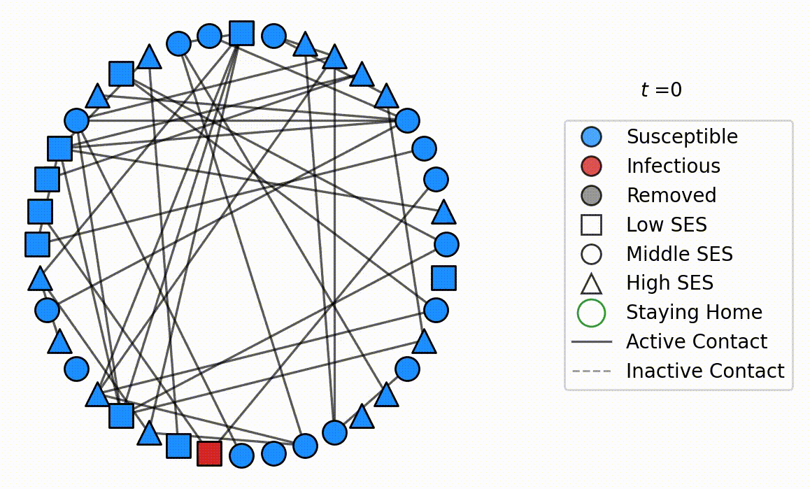
Figure 1. Segregated Spreading
Blue, red and gray respectively signify \(S\) (Susceptible), \(I\) (Infectious), and \(R\) (Recovered) states. Squares, circles, and triangles respectively denote agents from low, middle, and high SES communities. The green dash-dotted circles indicate staying home. Solid and dashed lines demonstrate connections capable and incapable of disease transmission.
Epidemics on Empirical Dynamic Networks
By using different shuffling methods and categorizing the results using k-means clustering we studied each correlation’s effect on hindering/enhancing the spreading phenomena. We observed that causal temporal correlations reduce the size of an outbreak, on the other hand, periodical correlations which can either decrease or increase the probability of an outbreak, have no significant effect on the size of a possible outbreak.
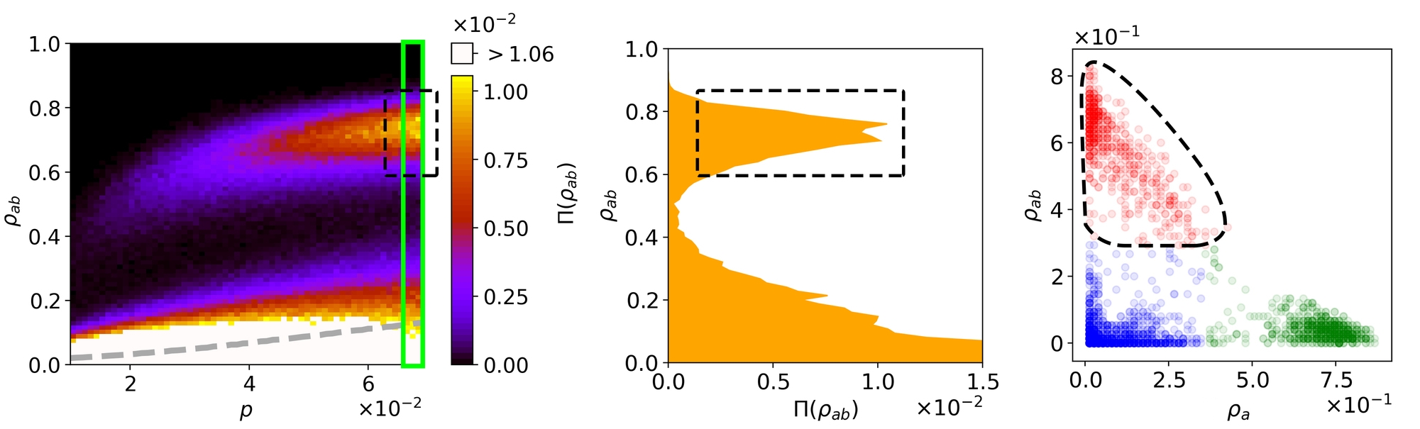
Figure 3. Spreading on Dynamic Networks
The figure demonstrates, how the k-means clustering measure works for our purpose. As an example, we see the coinfection dynamics on a shuffled hospital network. The left panel shows the density of the \({ab}\) population, and the probability that a realization settles on the given value of the density (\(\pi ( \rho_{ab}(p) )\): color code) while varying p, which is the first infection probability. The gray dashed curve demonstrates the average \(\rho_{ab}\). The middle panel distinguishes precisely the two epidemic branches in the left panel at \(p=0.069\), the vertical window. The right panel shows the fraction of individuals recovered from one disease (x-axis) and from both diseases (y-axis), within each realization. Each point denotes a single realization and different colors indicate different clusters: red (double infection outbreaks), green (single infection), blue (no outbreaks). The dashed shapes, encircle the realizations which make up the outbreak branch (OB) in each illustration. The number of realizations is 50000, but for illustrative purposes in the right panel, only a sample of 5000 realizations is depicted.
Figure and caption are taken from our paper (1)
Generated by my software ![]() Available under GPL-3.0 at this repository.
Available under GPL-3.0 at this repository.
Epidemics on Pedestrian Dynamics
In this work, we define a novel type of social distancing (keeping distance from other agents to avoid infection) based on the pedestrian dynamics. We consider both direct and indirect transmission by taking into account the role of the environment as a vehicle of spreading. By categorizing the population in three different compartments: \(S\) (Susceptible), \(I\) (Infectious), and \(E\) (Exposed) we simulate the spreading and predict the risk of infection for different levels of social distancing in multiple scenarios.
We won the \(2^{nd}\) place award in the scientific video contest of Dynamics of biological systems: from viruses to populations conference, held by Jagiellonian University for this animation. Presentation title: Social distancing in pedestrian dynamics and its effect on disease spreading
The circles denote agents. Blue, red, and gold respectively signify \(S\) (Susceptible), \(I\) (Infectious), and \(E\) (Exposed) states. The purple tiles demonstrate the contaminated environment. The green diamond is the target that the infectious agent tries to reach.
Karate Club
In this work, by modeling the balance dynamics on empirical social networks, such as Zachary’s karate club (2), we study the effect of heterogeneity on microscopic parameters of the system such as the mean value (+1, -1) of each dyad. We plan to proceed to formulate a mean-field approximation for this dynamics.
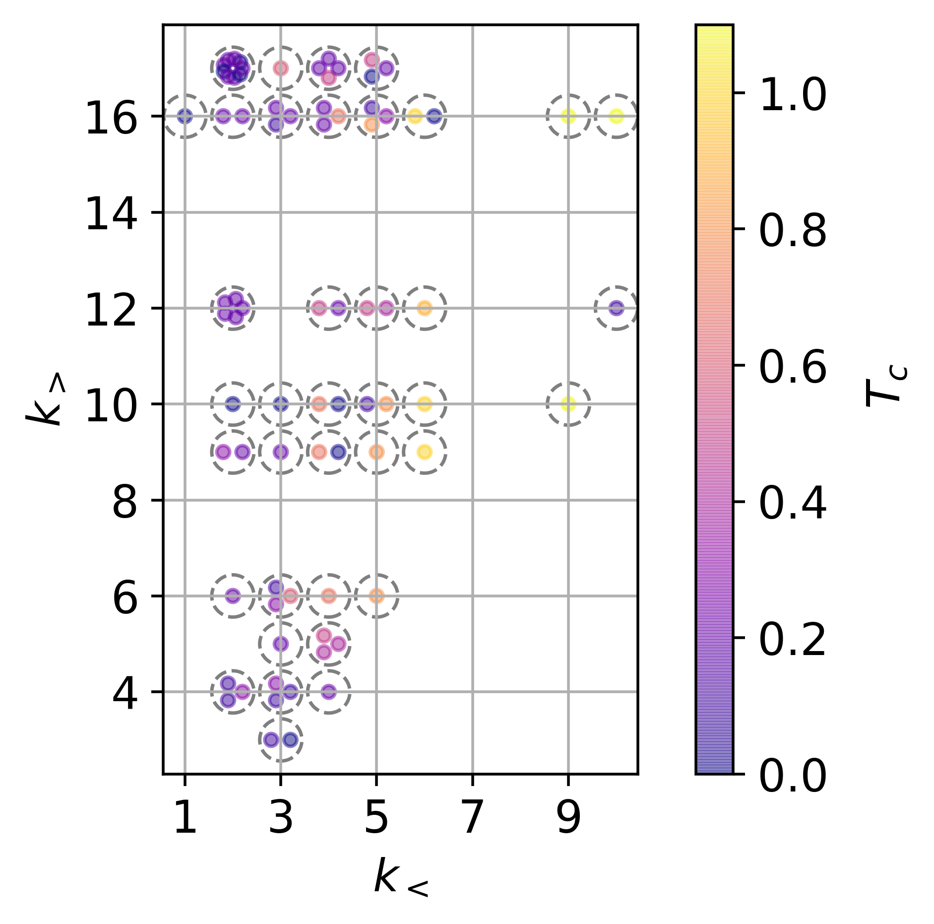
Figure 2. karate-club
Each point denotes an edge of the Zachary’s karate club, with \(k_<\) and \(k_>\) indicating the degrees of nodes on each side of the edge. Color code demonstrates \(T_c\) the transition temperature of the edge. Considering that multiple edges may have the same couple of values for \(k_<\) and \(k_>\), for demonstration purposes, the points denoting these edges are arranged in a circular manner and encircled by a gray dashed ring.
Teaching
Schelling Model
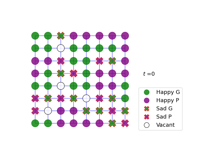
Figure 5. Schelling Model
Presented at Schelling Algorithm Implementation and Visualization workshop.